The colours in your home aren't just aesthetic choices — they actively influence how you feel, your energy levels, your ability to sleep, and how you experience each room. Understanding colour psychology lets you make deliberate choices about your wall art, rather than simply following trends.
How Colour Affects Mood
Colour psychology research consistently shows that certain colours trigger predictable emotional and physiological responses:
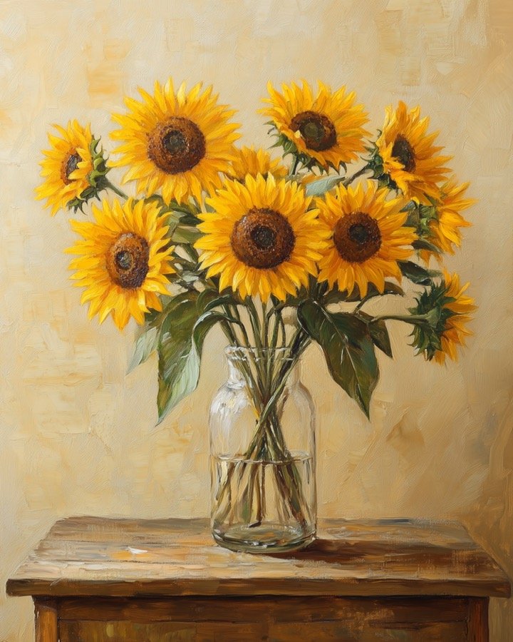
- Warm reds and oranges → raise heart rate, stimulate appetite, increase energy. Energising but can feel overwhelming in large doses.
- Blues → lower heart rate, reduce blood pressure, promote calm. Excellent for bedrooms and meditation spaces.
- Greens → associated with nature, rest, and balance. The easiest colour for the eye to process.
- Yellows → stimulate mental activity, create optimism, promote communication.
- Purples → associated with creativity, luxury, and introspection.
- Neutral tones (cream, beige, warm grey) → versatile, calming, make spaces feel larger.
Room-by-Room Colour Guide
Living Room
The living room needs to work for multiple moods — entertaining, relaxing, family time. Warm neutrals anchored by one or two accent colours work best. Earth tones (ochre, terracotta, forest green) are currently the strongest choice for a classic look that won't date. Art in these tones will anchor the palette. Try our Colour Palette Generator to build a living room scheme.
Bedroom
The bedroom should be restorative. Soft blues, muted greens, warm creams, and dusty pinks all perform well. Avoid high-contrast, high-saturation art in the bedroom — it can subconsciously stimulate the brain when you're trying to wind down. Soft watercolour florals and gentle landscapes are ideal.
Home Office
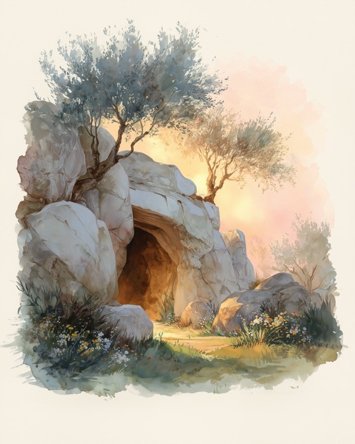
For focus and productivity, lean towards greens and blues — both associated with clarity and sustained attention. A nature landscape print or botanical print brings biophilic benefits (the psychological benefits of connecting with nature) even in an indoor office.
Kitchen
Warm, appetite-stimulating colours work well here. Herb botanicals, fruit illustrations, and warm ochre or terracotta tones are both practical and attractive.
Nursery
Soft, muted tones — sage green, dusty blue, warm cream — create a calm environment for sleep and play. Avoid overly bright, high-contrast art in rooms where you want babies and toddlers to sleep easily. Our nursery collection is designed with this principle in mind.
The Art of Colour Balance
A practical framework interior designers use:
- 60%: Dominant colour (walls, floors, large furniture)
- 30%: Secondary colour (rugs, curtains, upholstery)
- 10%: Accent colour (art, cushions, ornaments)
Your wall art lives in that crucial 10% — which is why choosing the right accent colour in your art can make or break a room's palette.
Choosing Art for Specific Moods
- Want more energy? → Choose art with warm golds, ochres, or coral tones
- Want more calm? → Choose art with soft blues, muted greens, or cream tones
- Want more sophistication? → Choose art with deep greens, dark backgrounds, or dramatic contrasts
- Want more warmth? → Choose art with botanical forms, organic shapes, or earthy palettes
Build Your Palette
Free Colour Palette Generator
Design your room's colour scheme before you choose your art — free, instant, no sign-up.
Try the Colour Tool →