Room Palette Guide
Colour Palettes for Bedrooms
Your bedroom palette should help you wind down, sleep well, and wake up feeling restored. Research consistently shows that certain colours support sleep and relaxation — these palettes are built around those principles.
Curated Schemes
5 Bedroom Colour Palettes
Dusty Blue
Muted blue-greys for a deeply restful, spa-like atmosphere.
Blush & Cream
Warm pinks and soft cream — romantic and deeply soothing.
Sage & White
Soft sage green — proven to reduce stress and improve sleep quality.
Warm Greige
The perfect warm neutral — neither too grey nor too beige.
Midnight & Gold
Deep navy with gold accents — dramatic and luxurious.
Perfect Art Styles
Art That Works in Your Bedroom
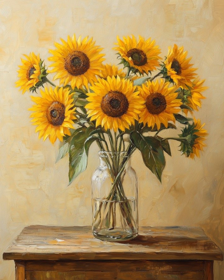
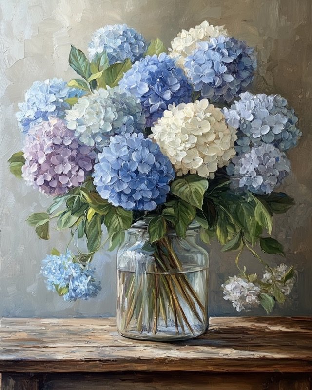
- Soft florals
- Watercolour botanicals
- Abstract landscapes
- Scripture prints
- Portrait art
Free Tool
Build Your Custom Palette
Use our free Colour Palette Generator to create your own scheme from any base colour.
Try the Generator →Expert Advice
Bedroom Colour Tips
Avoid high contrast
High contrast art (stark black and white) can subconsciously stimulate the brain. Opt for softer tonal ranges in bedroom art.
Soft art above the bed
Hanging art above the bed is the most impactful styling choice. Choose something personal and calming — not bold or graphic.
Cool colours support sleep
Blues and greens lower heart rate and reduce blood pressure. Warmer palettes are fine but cooler tones give a genuine sleep advantage.
Layer your whites
Pure white and off-white on the same wall look mismatched. Choose either warm white (cream) or cool white, and stay consistent.
More Room Guides

Shop the Look
Find Art That Fits Your Bedroom Palette
Browse 300+ instant-download digital prints — all designed to complement premium home interiors.